

The graphic redesign of a website is a crucial strategic approach, especially for brands like Eric Favre, recognized in the field of sports nutrition and well-being. This article explores the process and impact of the graphic redesign of the Eric Favre site, with an emphasis on the importance of visual alignment with brand values.
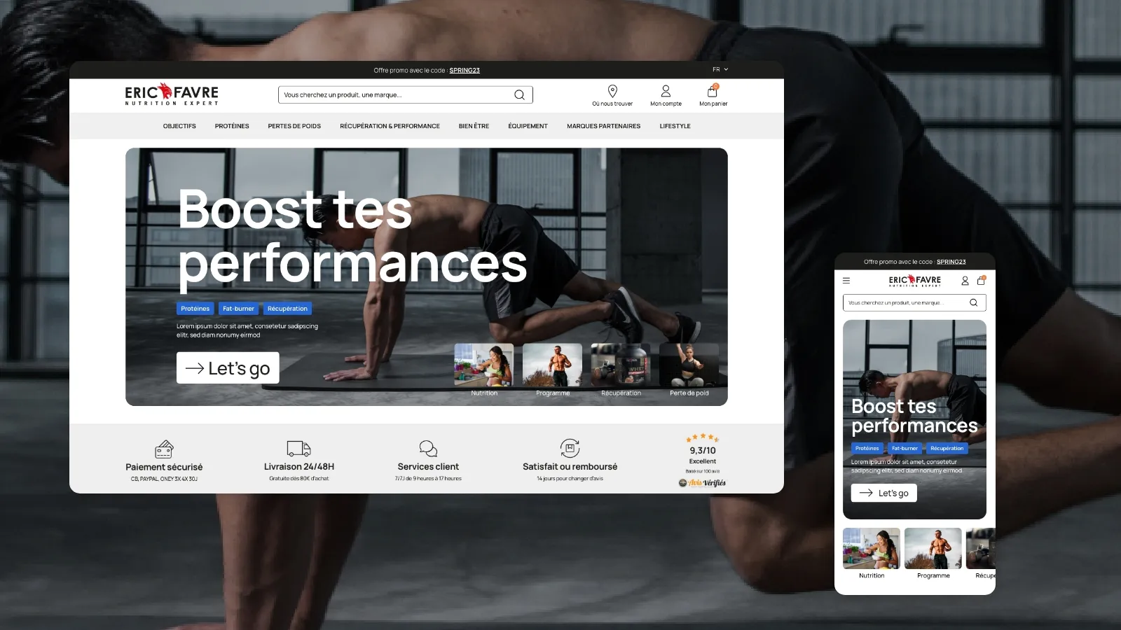
The Importance of Visual Identity
The redesign began with a reassessment of Eric Favre's visual identity. The aim was to create a design that reflects the values of quality, innovation and performance that are dear to the brand.
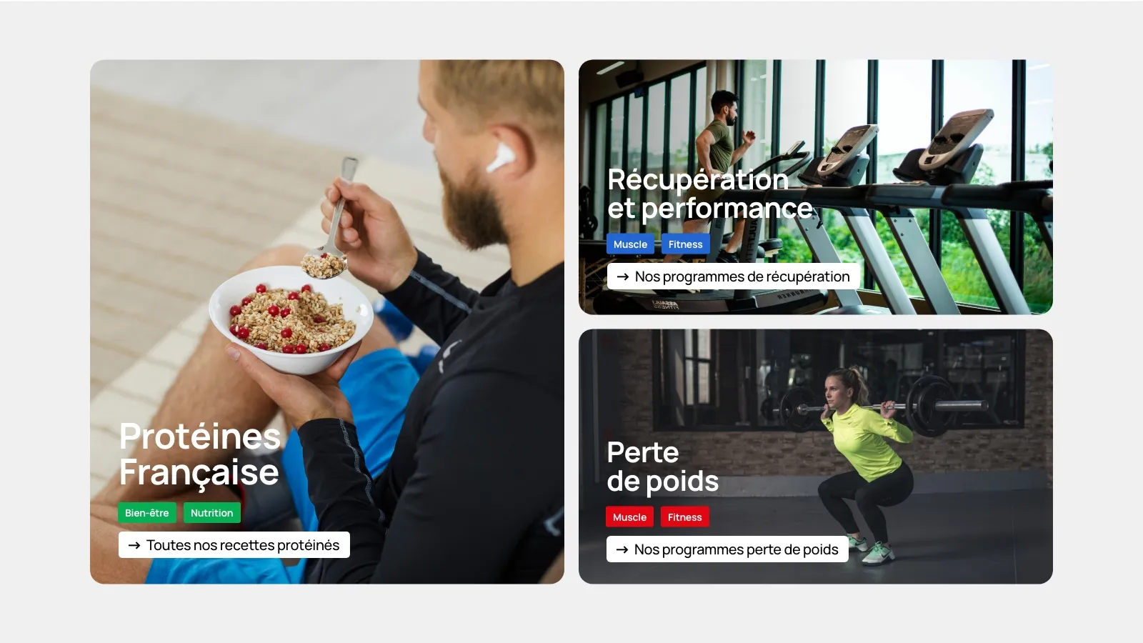
A user-centered approach
The design of the new design was guided by a deep understanding of the target users. The browsing experience has been simplified, making accessing product information more intuitive and engaging.

Color Palettes and Typography
The color palette has been carefully chosen to evoke both energy and reliability. The modern and legitimate typography reflects on the overall clarity and aesthetics of the site, reinforcing the identity of the brand.
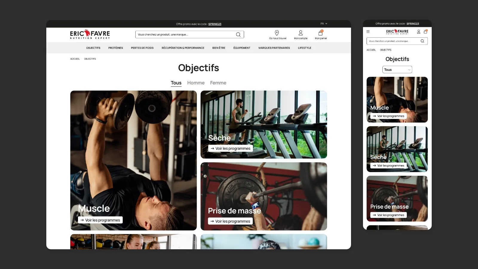
The graphic redesign of the Eric Favre site demonstrates the significant impact that a thoughtful design aligned with brand values can have. This transformation is not only an aesthetic improvement, but a key step in the growth and evolution of the brand in a competitive market.