

Redesign of the Well site under Shopify: elegance and performance
Much more than an underwear brand, Well embodies know-how made in France recognized for its quality and timeless elegance. Since its beginnings, Well has been able to combine comfort, femininity and innovation in its creations. It is with this spirit of perfection and authenticity that the redesign of their e-commerce site was launched, in order to strengthen the brand image and guide users in a modern, fluid and pleasant shopping experience. The objective? Combine a clear and ergonomic interface with a modern design to enhance the brand's universe while optimizing the customer journey.
.webp)
A modern and elegant artistic direction for a brand that is always up to date
Realign the brand universe on a clean but striking site
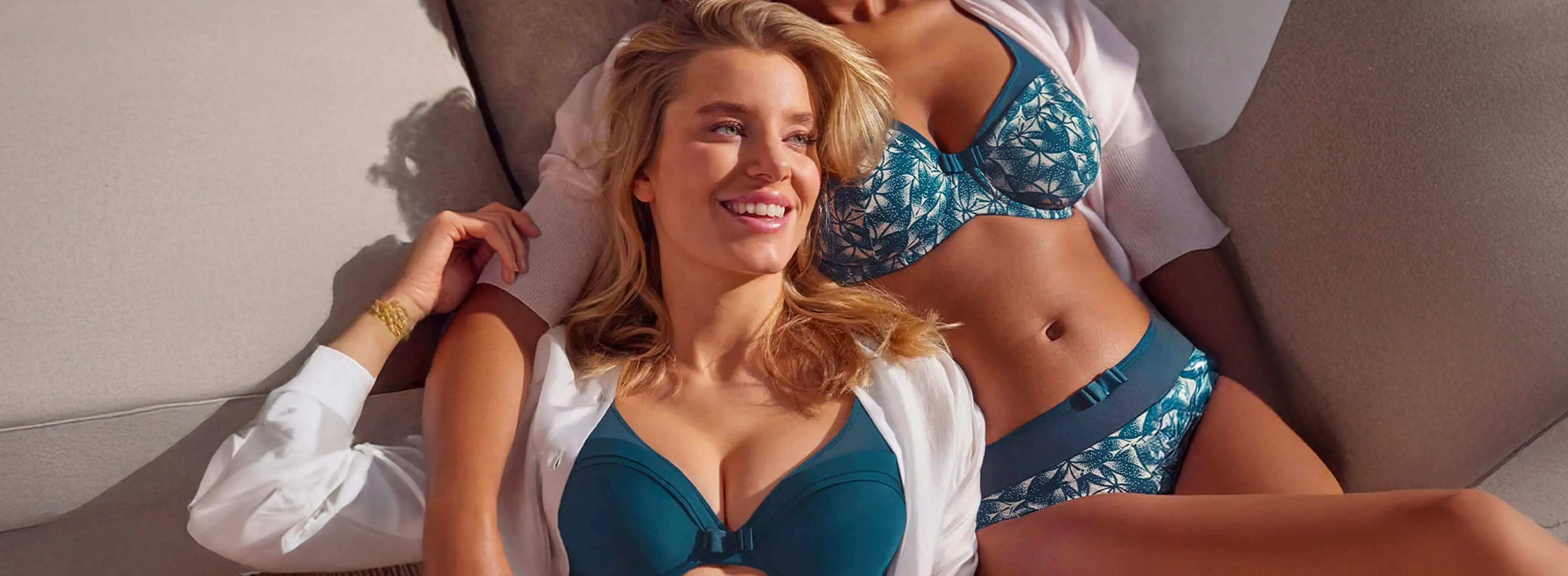
The first mission was to rework the artistic direction of the site. The design has been redesigned to be both current and timeless, in line with Well's values. The focus was on a clean visual, leaving an important place for the image to reflect the elegance and sophistication of the brand.
Large product photos, video clips and the integration of lookbooks make it possible to energize the pages, while creating an immediate immersion in the Well universe. This modern design, accompanied by smooth navigation, helps the user to project themselves and discover all the products in optimal conditions. The site also features a neutral color palette, showcasing creations without overloading the page.
An ergonomic interface for a frictionless shopping experience
Fluid and optimized navigation, simplified journey
The redesign of the site made a point of offering an optimal user experience (UX), by rethinking the structure of the site and navigation. Each page has been studied to facilitate access to products, reduce the number of clicks and improve interaction with key elements of the site.
The product sheet has been revisited to more intuitively display all the important information (availability, sizes, colors) and to guide the user in his selection. Design elements, such as add to cart buttons, are now more visible and easier to handle. All in a constant effort to reduce any friction to make the purchase as pleasant and fast as possible.
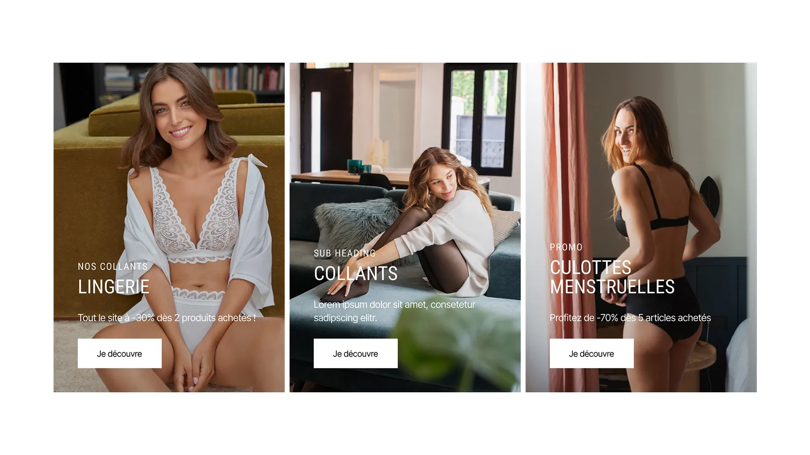
Reworked collection pages to stimulate purchases
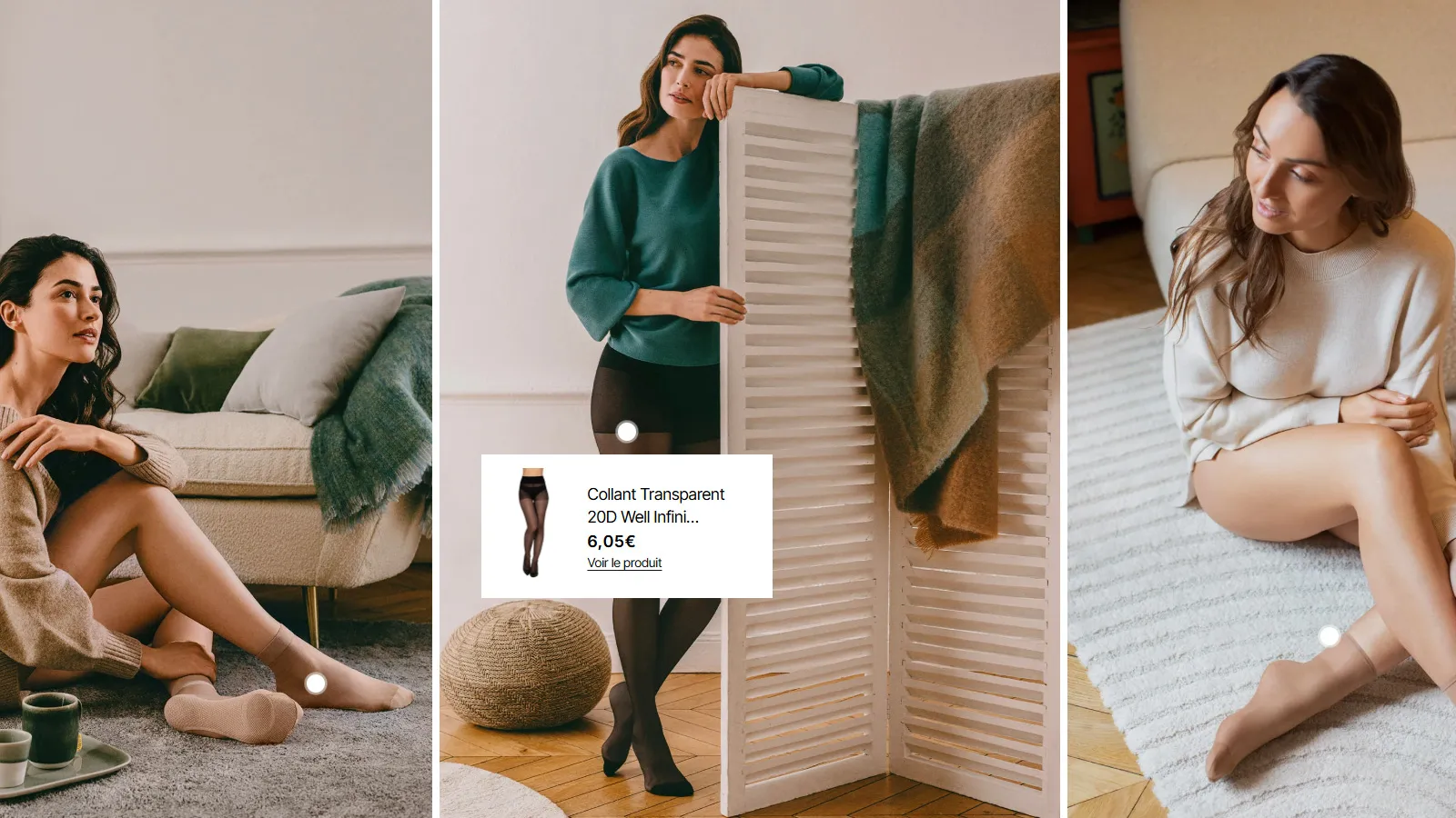
An optimized filter system and videos to boost the product experience
The collection pages have been redesigned to allow users to quickly filter products by criteria (size, color, material) and refine their search in the blink of an eye. Improved sorting allows you to navigate effortlessly and find exactly what you are looking for in a few clicks.
The addition of video clips and dynamic visuals on product pages and collections makes it possible to better present items in context, in motion. These videos play a crucial role in presenting products and facilitating decision-making. The objective is to make the shopping experience more engaging, by allowing each user to discover products from different angles, whether visual or in terms of comfort and quality.
Conclusion: an efficient site at the service of elegance
The redesign of the Well e-commerce site is a perfect example of how a careful interface and relevant UX/UI choices can redefine the user experience while staying true to a brand's identity. With a modern design, an optimized shopping journey and a particular attention to product presentation, Well provides its customers with a site that is as elegant as it is effective. By combining a coherent artistic direction, intuitive navigation and dynamic content, the site is a real seductive tool for the brand, combining aesthetics, fluidity and performance.


.webp)